FMP - Book - Blurb Make Your Own Book
18.6.10
16.6.10
FMP - Website animation - book
Displayed on the website would be indication to the printed book. As i do not want this to be read by general public, i would blur the text displayed here.
FMP – Website Animation – The Dash
For the online site I have decided to animate sections in the style of the printed book.
This Is the poem by Linda Ellis – The Dash.
I have included names of some family members, within dashes, lost over the years.
This Is the poem by Linda Ellis – The Dash.
I have included names of some family members, within dashes, lost over the years.
27.5.10
25.5.10
FMP - Exhibition - Banner
Above my display case I would like to suspend this banner as a double-sided print.


24.5.10
FMP - Online – Website trials
Looking at design layouts for the website. I am thinking to keep with the layout styling as used in the book in order to keel the relationship. It may be seen as a simple layout, but I am trying to keep the focus on the content over concept.
FMP - Book - Online
As the three physical printed books only display the front cover and two double page spreads, I am intending to simulate the book on display on a section of the website. I aim to do this through an animation. As the content is sensitive and personal I will be disguising the text so it is unreadable.
FMP - Online - Digital resource
As we live in a very digital age, I will be putting all the information for my children in a single site as a reference for them. This would also be a source that can be updated in-between editions of the printed book.
FMP – Wrapping paper – Final
After prolonged looking at my wrapping paper short list I have decided I was still not happy with my design so far, I felt there was something still missing. Looking at sweet wrappers it struck me I was looking for a feeling of luxury in my design but still whilst keeping it simple.
The modification I implemented was based on my set4 designs but altering the size and breathing space between the repetitions.

The modification I implemented was based on my set4 designs but altering the size and breathing space between the repetitions.
FMP – Wrapping paper – Thoughts
I started to think adding the colour to the emblem would give it a different feel…. I felt I was right; I just did not like it! By adding the red it has taken away the subtle feeling of emblem I was trying to create. I chose to base the emblem on light weighted lines; the colour seems to make these heavier.
The breathing space between the logo also gives a different feeling to the layout. I am more in favour of the mono emblem with a lot of negative space.
The breathing space between the logo also gives a different feeling to the layout. I am more in favour of the mono emblem with a lot of negative space.


23.5.10

FMP - Imagery – MDJ colour
Looking at the mono image I felt it could do with colour added. Now iv seen it I reverse my decision and will return to mono.


21.5.10


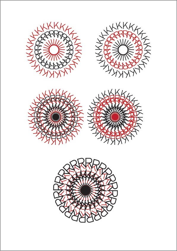
FMP - Emblem – Short list
I’ve narrowed my emblem style down to these two.
I do prefer the positive and negative versions but can see the need for colour.
I do prefer the positive and negative versions but can see the need for colour.

FMP - Imagery - Treatment 2
Started to think the previous style of imagery was a little heavy so decided to take a new direction. This image is in negative form.


18.5.10
FMP – Centre spread - idea
Although the book is kept as a blank white page on the left side, I am considering breaking away from this rule with a double page spread.
If I do adopt this, I am still undecided if to use a two-image area, single image area or full bleed image.
The more I see the full bleed is spread, the less it is appealing to me.
two-image area

single image area

full bleed image

If I do adopt this, I am still undecided if to use a two-image area, single image area or full bleed image.
The more I see the full bleed is spread, the less it is appealing to me.
two-image area

single image area

full bleed image


Subscribe to:
Comments (Atom)